The CRO panic usually starts the same way. Pipeline is soft, revenue targets are still fixed, and someone asks for a faster checkout, stronger headline, or a new popup by Friday.
That reaction is predictable. It is also how teams waste months chasing visible changes instead of measurable gains. New hero copy can help. A redesigned CTA can help. Even a homepage refresh can help. None of those tactics add up to a conversion program unless they come from diagnosis, prioritization, testing discipline, and a clear definition of what a conversion rate actually measures.
The gap between average performance and top-performing sites is real, but the takeaway is not that teams need a bag of hacks. The takeaway is that many agencies and in-house teams still run CRO as a series of isolated ideas instead of a repeatable operating system.
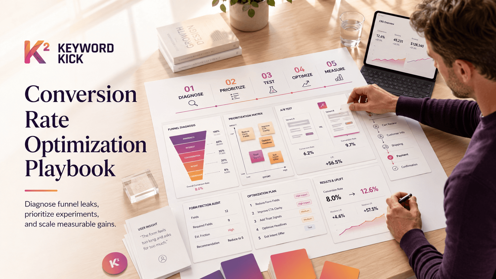
The work that improves conversion rates consistently follows a playbook. Start by finding where prospects drop out. Rank opportunities by business impact, not by how easy a page is to edit. Test changes cleanly. Remove friction from copy, flows, and technical paths. Then measure lift in a way the business can trust.
That is how CRO stops being a quarterly scramble and becomes a system you can run again and again.
Stop Guessing Start Diagnosing Your Conversion Funnel
Most CRO work fails before a test even launches. The team picks a page they dislike, not the step that leaks the most revenue.
That's backwards. A rigorous workflow starts by segmenting the funnel, prioritizing the stage with the largest volume, and focusing on that single highest-impact area first, as Winning by Design explains in its guide to increasing conversion rate. The common mistake is optimizing low-volume pages that can produce nice-looking percentage lifts without changing the business outcome.
Start with the full path, not the final conversion. If you care about purchases, don't just track purchases. Track product view, add to cart, checkout start, payment completion, and confirmation. If you care about leads, map landing page visit, CTA click, form start, form submit, booked meeting, and qualified lead.
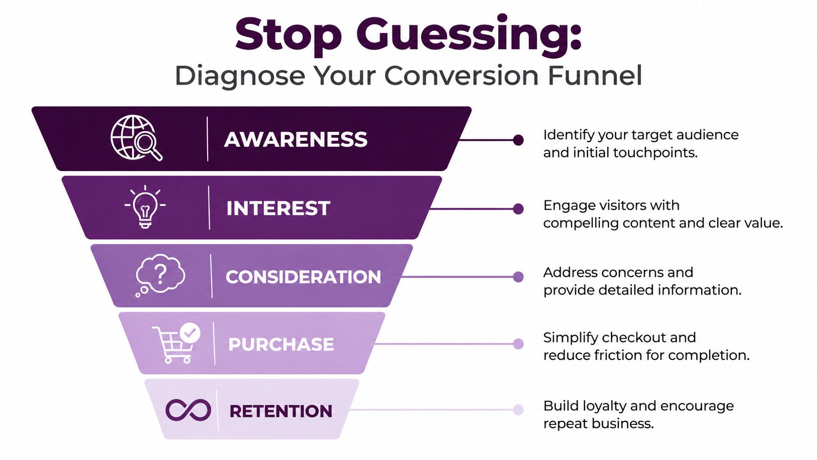
Map the funnel before touching the page
In GA4 or any equivalent analytics stack, define the funnel in plain business terms. Don't build it around pageviews alone. Build it around observable user actions.
A clean diagnostic pass usually includes:
Traffic segmentation: Break results out by source, device, landing page, and major audience type.
Micro-conversions: Track steps that show intent, not just the final sale.
Drop-off review: Find the stage with the largest absolute loss of users.
Error checks: Look for broken events, payment failures, form validation issues, and dead clicks.
Behavior review: Pair funnel data with session replays, heatmaps, support transcripts, and internal search terms.
If your team needs a quick baseline definition, this conversion rate glossary entry is useful for aligning everyone on what counts as a conversion before the arguments start.
Practical rule: Don't ask “How do we improve conversions?” first. Ask “Which step loses the most qualified people, and what evidence do we have?”
Use both quantitative and qualitative evidence
Analytics tells you where the leak is. Qualitative review tells you why.
A common pattern looks like this: the checkout-start rate seems healthy, but completion drops sharply. Quantitative data says checkout is the problem. Session review then shows users hunting for shipping details, stalling on coupon fields, or failing a clunky mobile payment form. Now you have a usable hypothesis.
Here's a simple way to structure the audit:
Audit layer | What to look for | What it tells you |
|---|---|---|
Funnel analysis | Largest step-to-step drop | Where to focus first |
Device split | Mobile versus desktop gaps | Whether the issue is usability or layout-related |
Landing page review | Misaligned traffic and page intent | Whether the promise matches the click |
Form analysis | Abandonment around specific inputs | Which fields create friction |
Session replays | Hesitation, looping, rage clicks | Why users get stuck |
Don't optimize everything at once. That's not thoroughness. It's a way to make attribution impossible.
Diagnose the leak, not the symptom
Teams often react to surface complaints. “The CTA is weak.” “The page needs more proof.” “We need stronger copy.” Sometimes that's true. Often it isn't.
If users never reach the CTA because the page loads slowly, your copy isn't the problem. If they reach checkout and abandon because the process asks for unnecessary information, your brand messaging isn't the problem. If they can't find the right product or answer, persuasion won't rescue the session.
The best CRO teams behave less like designers chasing opinions and more like investigators building a case.
That shift changes everything. You stop debating random ideas and start making decisions from evidence.
How to Prioritize High-Impact Experiments
A CRO backlog can go off the rails in a week.
One audit produces 20 ideas. The paid team wants new landing pages. Product wants a navigation overhaul. Brand wants a homepage refresh. Leadership wants personalization because a competitor launched it. If nobody applies a system, the roadmap turns into a list of whoever argued hardest in the meeting.
That is how teams stay busy and still miss revenue targets.
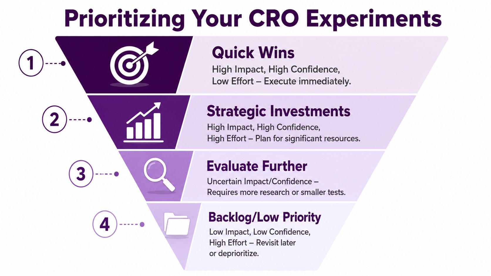
The fix is a repeatable prioritization model that forces trade-offs. I use ICE because it works under real operating constraints: Impact, Confidence, Ease. It is not perfect. It is useful. That matters more.
Score ideas like an operator
Every experiment should earn its place on the roadmap.
Score each idea against three questions:
Impact: If the test wins, does it improve a high-traffic or high-intent step in the funnel?
Confidence: Is the idea supported by evidence from analytics, session replays, user research, or sales feedback?
Ease: Can the team ship and measure it without burning a full sprint on setup, QA, and rework?
That last point gets ignored too often. A test with theoretical upside but heavy implementation cost can be the wrong choice if three smaller tests will teach you more in the same time.
A simple comparison makes the trade-off clearer:
Experiment | Impact | Confidence | Ease | Likely priority |
|---|---|---|---|---|
Remove nonessential fields from checkout | High | High | Medium | Run soon |
Full homepage redesign | Unclear | Low | Low | Backlog |
Rewrite CTA on paid landing page | Medium | Medium | High | Quick test |
Rework product filtering | High | Medium | Medium | Strategic |
Redesigns usually score worse than teams expect. They bundle multiple changes, drag out production, and make attribution harder. A narrower experiment on checkout friction, offer framing, or page structure often produces cleaner learning and faster wins.
Prioritize revenue influence, not internal visibility
The homepage gets attention because everyone sees it. That does not make it the best place to test.
Prioritization should follow buying intent and funnel economics. A small lift on a product page, lead form, or checkout step can outperform a polished top-of-funnel update because the user is closer to action. Agencies and in-house teams both miss this when they let stakeholder visibility override conversion potential.
Benchmarks can help generate ideas, but they should not decide the roadmap. According to Matomo's roundup of conversion rate optimisation statistics:
personalized CTAs perform 202% better than basic CTAs
increasing landing pages from 10 to 15 can raise leads by 55%
companies with more than 40 landing pages can see conversion lift of more than 500%
a single CTA on a landing page can increase conversions by 371%
adding video can increase conversions by 86%
Useful numbers. Wrong use case, wrong page, wrong audience, and they become expensive distractions.
A personalized CTA on a low-intent page will not rescue weak traffic. A video test is not a priority if users are abandoning because checkout asks for unnecessary information. Strong CRO programs treat benchmarks as inputs, not marching orders.
A strong idea on the wrong page is still a weak test.
Build a roadmap your team can actually run
A backlog is not a brainstorm doc. It is an execution tool.
Keep it short. Three to five active experiments is usually enough for a disciplined team. More than that, and quality slips. QA gets rushed, analysis gets sloppy, and nobody finishes the learning loop.
Each experiment should include:
Target step: where the test sits in the funnel
Observed problem: the friction or behavior that triggered the idea
Hypothesis: the change being tested and why it should work
Primary metric: the one outcome that determines success
Owner: the person responsible for shipping and reading out results
That structure is what turns CRO into a playbook. It gives agencies a repeatable client process and gives in-house teams a way to build momentum without chasing random wins.
Designing and Running Statistically Sound Tests
A team launches a redesign, sees conversions tick up after three days, and calls it a win. Two weeks later, performance drops back to baseline, nobody can explain why, and the roadmap is now built on a false positive.
That is how weak testing programs waste months.
A statistically sound test does two jobs. It measures impact, and it protects your team from telling itself convenient stories. Agencies need that discipline across clients. In-house teams need it to build a program that keeps producing learnings instead of random spikes.
Choose the method that fits the decision
Start with the question, not the tool.
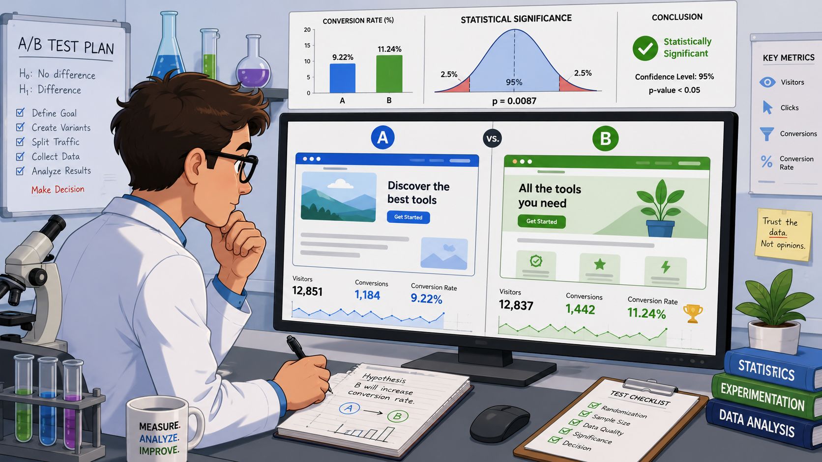
Use an A/B test when you have a clear control, a single meaningful variation, and enough traffic to reach a defensible read. This works well for offer framing, form length, CTA language, pricing page structure, and checkout steps.
Use multivariate testing only when traffic is high and the team can handle the analysis. Otherwise, you spread traffic too thin, blur attribution, and end up with noise dressed up as insight.
Use qualitative research when you still do not know what is wrong. Session replays, usability interviews, support logs, and on-site search terms are better for diagnosis than forcing a test onto a vague problem. Teams working on acquisition pages should also review adjacent intent and traffic quality. A practical reference point is this ecommerce SEO checklist, especially if landing page tests are being polluted by weak search alignment.
If the issue is undefined, research first. If the issue is defined but the fix is uncertain, test.
Write hypotheses that can fail
Vague hypotheses produce vague analysis.
“We think a cleaner page will perform better” is not a hypothesis. It gives the team too much room to reinterpret the result later.
A usable hypothesis is specific about the change, the expected behavior, and the reason. For example: “Removing optional checkout fields will increase completion rate because buyers can finish the form faster and face fewer hesitation points.”
That format matters because it forces cause and effect onto the page before the test starts. It also keeps copy changes grounded in user behavior rather than taste. If your team keeps mixing education, messaging, and persuasion into one undefined task, review these content writing and copywriting differences. The distinction helps when a test is really about intent clarity versus sales copy strength.
If the team cannot explain why a variant should change behavior, the test is not ready.
Set the rules before launch
Poor test reads usually come from setup mistakes.
The common failures are predictable:
Too many variables changed at once: a new headline, new CTA, new layout, and new trust section in one variant destroys attribution.
Mixed traffic with no segmentation: branded search, paid social, email, and returning users can respond very differently.
Short test windows: weekday behavior, promotion cycles, and sales events can distort the result.
Metric shopping after the fact: teams lose the primary metric, find a friendly secondary number, and call the test a success anyway.
A pre-launch checklist prevents a lot of this.
Check | Why it matters |
|---|---|
One primary metric defined | Stops cherry-picking |
One core variable changed | Keeps attribution clear |
Audience and page scope confirmed | Cuts avoidable noise |
Tracking QA completed | Prevents false reads |
Sample size and stop rule agreed | Reduces premature calls |
Read results like an operator, not a cheerleader
Winning tests matter. Losing tests matter too. In a healthy CRO program, both improve the playbook.
A test that fails to lift can still tell you the friction was misdiagnosed, the audience was too broad, or the proposed change was too weak to matter. That is useful. It keeps the next round focused.
The fundamental mistake is treating testing like a hunt for trophies. Strong programs treat it like system maintenance. Clean hypotheses, clean setup, clean analysis. That is how teams build repeatable gains instead of collecting isolated wins they cannot reproduce.
Optimizing Your Copy Checkout and User Flows
A user clicks a paid ad for “same-day business insurance,” lands on a page that talks about “modern risk solutions,” hits a seven-field form, and stalls at the phone number. The problem is not motivation. The path from intent to action broke.
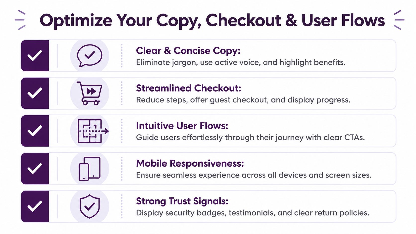
That is why strong CRO programs treat copy, forms, and flow design as one operating system. Agencies and in-house teams that improve conversion rates consistently do not chase isolated button tests. They build a repeatable playbook for message clarity, friction control, and next-step design.
Fix the message before you optimize the path
If users cannot explain the offer in a sentence, the rest of the flow is working uphill. Pages need to answer four questions fast:
What is this
Who is it for
Why does it matter
What should I do next
That sounds basic. It is also where a lot of teams miss. Brand language creeps in. Headlines get clever. CTAs become vague. Then the team wonders why traffic reaches the page but does not move.
Clear copy does not mean flat copy. It means specific copy. Lead with the outcome, use the words buyers use, and keep one primary action per page. If the visitor came from paid search, match the promise from the ad. If the visitor came from email, assume more context and reduce repetition.
Teams also confuse education with conversion. Both matter, but they do different jobs. This breakdown of content writing and copywriting differences is a useful reminder. Informational content builds understanding. Conversion copy reduces hesitation and gets the next click.
Cut form friction with a hard standard
Every extra field needs a reason strong enough to survive scrutiny. “Sales might want it later” is not a reason. “We need it to price the quote, route the lead, or fulfill the order” is.
The practical rule is simple. Ask only for what the next step requires.
Here is a cleaner way to review forms and checkout flows:
Form element | Keep it when | Remove or delay it when |
|---|---|---|
Contact details | Needed to fulfill or follow up | It is only useful for later enrichment |
Company info | Required for routing or qualification | Sales can collect it after intent is confirmed |
Phone number | Sales requires it for immediate follow-up | Email is enough for the next step |
Multi-step flow | It lowers cognitive load for longer processes | It adds clicks without reducing effort |
Progress indicator | Users need to know how much is left | The process is short and obvious |
Users do not abandon because a form is slightly inconvenient. They abandon when the ask feels disproportionate to the value on the page.
Here, a playbook becomes critical. Set field-level rules once, document them, and apply them across quote forms, demo requests, lead magnets, and checkout. That creates consistency. It also stops internal stakeholders from adding junk fields every quarter.
If you run an eCommerce operation, the same discipline should carry into category pages and product discovery. This eCommerce SEO checklist is useful because conversion flow problems often start upstream, in weak site structure and unclear product paths.
Remove side quests from the user flow
Good flow design keeps momentum. Each page should have a clear job, and each step should prepare the next one.
Landing pages should support one primary action
Product pages should answer objections near the decision point
Checkout should make steps obvious and keep distractions low
Confirmation pages should continue the session with a relevant next action
Trade-offs matter here. Removing navigation from checkout can improve completion, but support-heavy or high-consideration purchases may still need access to shipping, returns, or contact information. A shorter flow is not always a better flow. A clearer flow is.
Use copy to reduce uncertainty at moments of commitment. Button labels should describe the next action. Field labels should be explicit. Error states should explain how to fix the problem. Trust signals belong near form submission, payment, and final review. Not buried in the footer where nobody needs them.
Teams get more reliable gains when they stop treating copy, checkout, and UX as separate workstreams. On pages that convert well, they function as one system, and the best CRO teams document that system so it can be repeated.
Fixing Technical and Navigational Bottlenecks
A common CRO failure looks like this. The team rewrites headlines, tests button colors, and adds more testimonials. Conversion barely moves because the core problem sits earlier in the journey. Users cannot find the right product, the right category, or the next step.
That is not a persuasion problem. It is a systems problem.
Baymard makes the case clearly in its eCommerce CRO research. The research points to issues like poor product finding, weak search, and category navigation problems as recurring causes of abandonment. I see the same pattern in audits. Teams spend weeks refining page messaging while search logic, menu structure, and mobile wayfinding keep blocking qualified buyers before they ever reach the decision point.
Speed belongs in the CRO playbook
Page speed should not sit in a separate technical queue for three quarters while marketing keeps testing creative around it. Slow pages reduce the number of users who even reach the moments you are trying to optimize.
Treat speed work as conversion work. Audit template weight, third-party scripts, image handling, and server response time on revenue-critical pages first. Product pages, cart, checkout, and high-intent landing pages usually deserve priority over low-value informational URLs. If your team needs a practical starting point, use this guide to improve page speed for conversion-focused pages.
Speed fixes also force trade-offs. Rich media can help sell complex products. It can also delay interaction on mobile. The right decision depends on what the asset contributes and where in the funnel it appears.
Audit navigation like a buyer with a deadline
Technical bottlenecks are often structural. Nothing is broken in the QA sense. The site asks too much work from the user.
Review the paths that drive revenue:
Onsite search: Does it return relevant results, recognize synonyms, and recover from misspellings?
Category structure: Can a first-time visitor predict where products live?
Filters and sorting: Do they match how buyers narrow options, or how your catalog is organized internally?
Mobile navigation: Can users move between menus, lists, and product pages without losing context?
Dead-end pages: Are there pages with traffic but no clear next action?
Run this review with session recordings, search logs, and path analysis open. Opinions are cheap here. Query refinements, filter usage, exit rates, and repeated backtracking show where discovery breaks down.
If users cannot find the right product, answer, or next step, the CTA is not the first problem. Site structure is.
Treat information architecture as a conversion system
Agencies often focus on page-level wins because those are easier to test and ship. In-house teams usually know the harder truth. Catalog logic, CMS constraints, search configuration, and navigation rules shape conversion long before a user reaches checkout.
The repeatable playbook is to include both. Fix local friction on key pages, then fix the underlying systems that keep recreating that friction across the site. Search, category logic, filters, mobile wayfinding, and speed are not support tasks around CRO. They are part of the operating model. Teams that treat them that way get more than isolated lifts. They build a site that keeps making it easier for buyers to complete the next step.
Measuring Lift and Scaling Your CRO Program
Monday morning, the team is celebrating a test win. Friday, nobody can explain why it worked, whether the lift held, or where to apply the lesson next. That is not a CRO program. It is a lucky result with a short shelf life.
Scaling starts with measurement discipline. For every experiment, log the baseline, the audience, the exact change shipped, the primary metric, the impact on downstream metrics, and the decision that followed. Keep the losses. They stop teams from recycling the same weak hypotheses every quarter and calling it a new test plan.
A simple experiment record should include:
Baseline performance: the starting rate for the step you are trying to improve
Hypothesis and rationale: the user problem you expected to reduce
Variant details: what changed, on which pages, for which audience
Primary and secondary outcomes: what moved, what did not, and whether any guardrail metric got worse
Follow-up decision: ship, iterate, segment further, or reject
In these instances, weak programs usually break. They report lift at the page level and ignore revenue quality, lead quality, refund rate, average order value, or step-to-step fallout later in the funnel. A test that raises form fills but lowers sales acceptance is not a win. A checkout change that lifts completion but increases support tickets may still be worth shipping, but only if the economics hold up.
The teams that keep getting results treat CRO as a repeatable operating system. They build a record of what has been tested, what was learned, and which patterns show up across pages, offers, traffic sources, and devices. Over time, that turns isolated experiments into a playbook. Agencies use it to avoid starting from zero on every client. In-house teams use it to defend roadmap priorities with evidence instead of opinion.
Report results in business terms. Say which friction point was reduced, where in the funnel it mattered, and how that change affected qualified conversions or revenue mechanics. Executives do not need another slide about variant color or button copy. They need to know whether the team is improving the system that produces conversions.
If you want a cleaner way to connect search performance, technical issues, page priorities, and user behavior into one workflow, take a look at Keyword Kick. It helps agencies and in-house teams turn scattered SEO and analytics data into prioritized actions, which makes it easier to spot where conversion and visibility problems overlap and what to fix first.