
You've got GA4 open in one tab, Search Console in another, a rank tracker sending its own alerts, and a spreadsheet where someone has tried to reconcile the differences. A traffic drop appears, but nobody can tell whether rankings fell, campaign tagging broke, consent reduced measurement, or the dashboard is reporting late.
That's the problem a website analytics dashboard should solve. It isn't just a prettier collection of charts. It should help a growth team answer three practical questions: what changed, how confident are we in the data, and what should we do next?
This guide builds that understanding step by step. You'll learn how a dashboard combines fragmented signals, how to choose role-specific KPIs, how to connect analytics with SEO and business data, and how to expose trust signals such as freshness, attribution confidence, and missing events. You'll also see why an uncluttered dashboard can still lead a team toward the wrong decision if its underlying tracking is unreliable.
The central idea is simple: raw traffic data becomes useful only when it supports a decision. A dashboard earns its place when an SEO specialist can identify a ranking problem, a content manager can find pages worth improving, an ecommerce lead can investigate checkout friction, and an executive can understand performance without opening five separate reports.
What a Website Analytics Dashboard Really Is
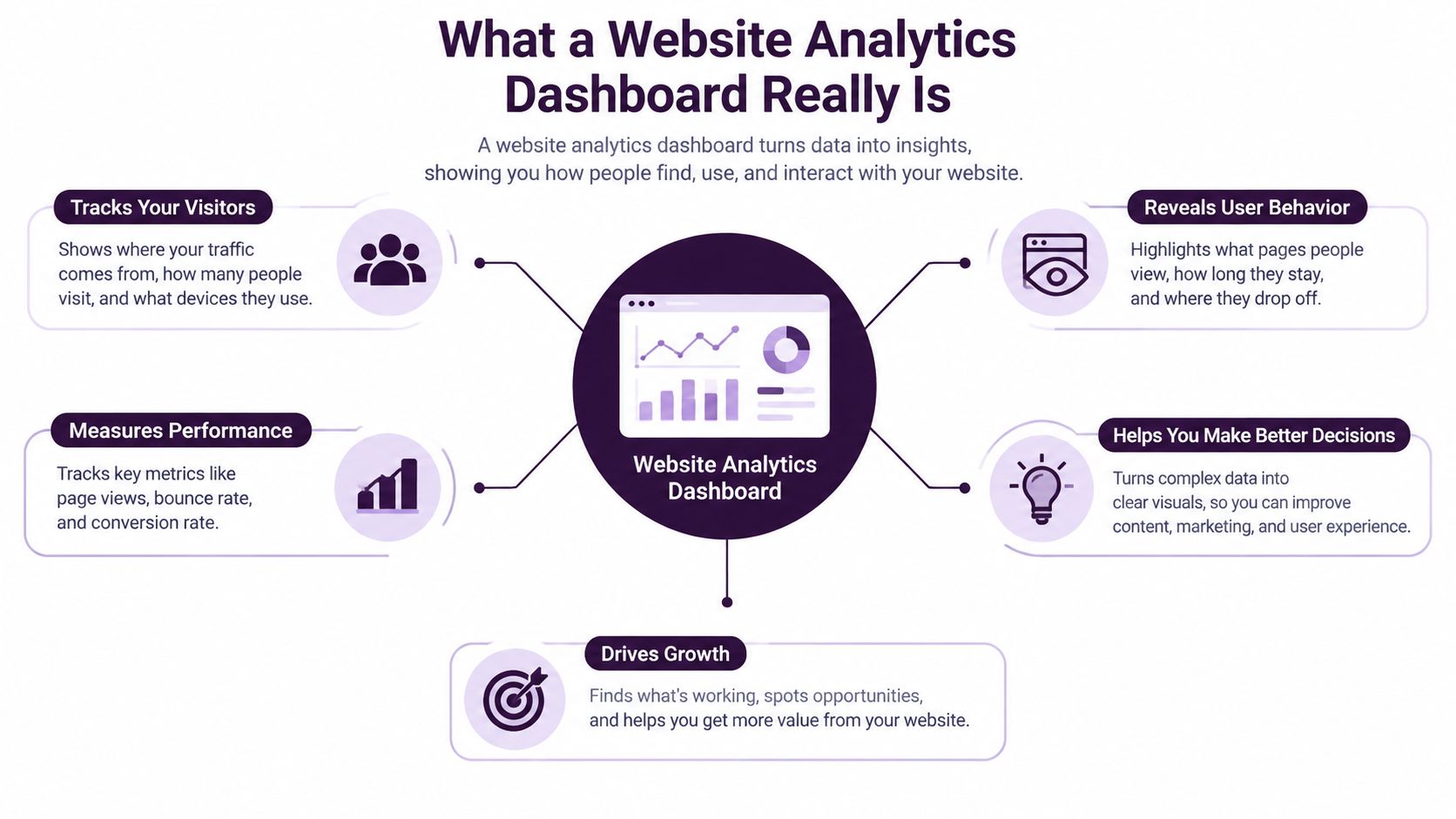
A website analytics dashboard is a shared workspace that organizes website performance data around decisions. It can combine visits, page views, traffic sources, exits, and geographic location into one interface, then present those signals as trends, comparisons, and summaries.
The difference becomes clearer with an airplane analogy. A pilot needs a cockpit that brings altitude, speed, fuel, direction, and warnings into view. The pilot doesn't want a stack of instrument manuals and separate printouts. In the same way, a growth team needs one view that shows what happened across acquisition, behavior, and outcomes.
The U.S. government's website analytics data dashboard illustrates how this model has developed. Its data products include daily CSV and JSON extracts for visits over a rolling period, top traffic sources, top exit pages, and page-level activity updates every few minutes. The broader lesson is that dashboards have moved toward operational reporting, not isolated historical reports.
The three layers of a useful dashboard
Think of a dashboard as a control room with three layers:
- The signal layer shows the current state. Examples include organic sessions, engaged sessions, form submissions, revenue, and technical errors.
- The context layer adds comparisons and segmentation. A KPI becomes more meaningful when you can compare it with a previous period, a peer benchmark, a device group, or a traffic channel.
- The action layer points toward investigation. A drop in conversions should lead to a channel, landing-page, event, or technical breakdown, not leave the user staring at a red number.
A standard report answers, “What does this dimension look like?” An exploration helps an analyst investigate a specific question. A dashboard is the compact workspace that keeps the most important signals visible for recurring decisions. It should link to deeper reports when someone needs to diagnose an anomaly.
The historical importance of Google Analytics explains why many teams still think of dashboards through a GA4 lens. W3Techs' Google Analytics usage data reports that Google Analytics is used by 83.2% of websites whose traffic analysis tool is known, representing 47.6% of all websites. The same source records a decline from about 86% of the analytics market in 2021 to roughly 78% in early 2025, showing that web measurement became a common standard before the market began diversifying.
For specialist use cases, the workspace may look different. A media team assessing creator performance, for example, may need an analytics dashboard for sponsorship deals that connects audience behavior with partnership evaluation.
If you're still clarifying the basics, this complete guide to web analytics provides useful background before you design the dashboard itself.
Practical rule: A dashboard should make the next question obvious. If a user sees a change but has no path to investigate it, the dashboard is reporting, not guiding.
Essential Metrics and KPIs by Role
The same website can produce different dashboard requirements for different teams. An SEO specialist needs to connect search visibility with landing-page outcomes. A content manager needs to understand whether articles attract qualified engagement. An ecommerce manager needs to follow the path from product discovery to purchase. An executive needs a concise view of business impact.
Trying to serve every audience with one crowded screen creates confusion. Start with the decision each role owns, then select a small group of KPIs that can change that decision.
A role-based comparison
| Role | Primary KPIs | Decision Trigger |
|---|---|---|
| SEO specialist | Organic sessions, clicks and impressions, rankings, organic landing-page conversions, technical health | Investigate ranking or landing-page changes and prioritize optimization |
| Content team | Landing-page entrances, engaged sessions, scroll or interaction events, assisted conversions, content conversion rate | Update, consolidate, promote, or retire content |
| Ecommerce manager | Product views, add-to-cart events, checkout progression, purchases, revenue by channel | Diagnose funnel friction, merchandising issues, or channel quality |
| Executive | Qualified leads or purchases, revenue, conversion trend, channel contribution, data confidence | Reallocate attention or budget toward the strongest business opportunity |
Acquisition metrics need an outcome
Acquisition metrics answer where visitors came from. Sessions, users, source and medium, organic clicks, and paid traffic can reveal reach, but they don't prove value by themselves. Pair acquisition with a downstream action, such as a qualified lead, purchase, or meaningful signup.
Search Console is especially useful for separating search demand from onsite behavior. A dashboard can place impressions and clicks beside organic landing-page engagement, helping the team distinguish a visibility problem from a page experience problem. For a practical metric framework, use this guide to web analytics metrics that actually drive growth.
Engagement is a diagnostic layer
Engagement metrics become valuable when they explain a conversion pattern. A high-exit page may indicate that the page answered the visitor's question, or it may reveal a broken next step. A low-engagement landing page may have poor message match, slow delivery, weak internal links, or a tracking event that never fires.
Use event names and definitions that your team understands. “Engaged session” should have a documented meaning in the dashboard, and custom interactions should state exactly what action they represent.
Benchmarks add context, but don't replace judgment
GA4 benchmarking is available through the Home page overview and standard lifecycle reports. A selected metric can be displayed against the median performance of a peer group and its peer range, as described in Google Analytics benchmarking guidance. This comparison can help distinguish a site-specific issue from a broader market movement.
Keep the benchmark optional on the main card. The dashboard should show the team's own trend first, then let users reveal comparison context when they need it. A peer benchmark can frame a question, but it can't explain the cause or determine whether the business goal is being met.
Dashboard Design and Data Integration Best Practices
A trustworthy metric can still fail if the dashboard makes it hard to read. Design should reduce the time between noticing a change and deciding where to investigate.
Put the most important decision at the top of the page. That might be organic conversion performance for an SEO team, revenue by channel for an executive, or checkout completion for an ecommerce operator. Supporting metrics should explain the primary KPI rather than compete with it.
Build a visual hierarchy
Use the first screen for the signals people need most often. A compact scorecard can show the current value, comparison period, target status, data freshness, and confidence label. A trend chart works well when direction matters. A table works better when the user must choose individual pages, campaigns, queries, or products.
A practical layout usually includes:
- Primary KPI cards: Show the headline outcome and its comparison.
- Trend visualization: Show whether the change is recent, gradual, seasonal, or isolated.
- Breakdown table: Identify the pages, channels, queries, or products behind the movement.
- Trust panel: Display the latest refresh, known delays, consent coverage, and tracking warnings.
- Action notes: Record launches, outages, migrations, or campaign changes that explain unusual patterns.
A clean chart isn't proof of clean data. The dashboard should show its limitations beside the numbers, not hide them in documentation nobody opens.
Integrate sources around questions
GA4 can describe onsite behavior. Search Console can show search visibility. A rank tracker can add keyword movement, while backlink and technical audit data can explain why important pages gained or lost strength. CRM or ecommerce data can connect website actions with downstream outcomes.
The integration should follow the decision. If the team asks, “Why did organic leads fall?”, the dashboard needs a path from leads to organic sessions, landing pages, queries, rankings, and technical conditions. Connecting tools merely because they are available creates a larger data pile, not a better explanation.
Keep date ranges consistent across widgets. If one card uses a calendar period and another uses a rolling comparison, label both clearly. Use the same naming convention for channels and campaigns, and document transformations applied between source systems.
Use progressive disclosure
The first view should be simple enough for a busy stakeholder to scan. Detailed filters, query-level tables, event parameters, and channel comparisons can sit behind expandable panels or linked views. This structure gives executives clarity without restricting analysts.
Charts show movement and shape. Tables support prioritization. A table of declining landing pages is more useful than a pie chart when someone must decide which page to update first.
Implementation Checklist for Data Sources Segmentation and Alerts
A dashboard becomes reliable through its setup process, not through its visual polish. Treat implementation as a sequence in which every stage creates a condition for the next one.
1. Connect and document the sources
Start with GA4, Search Console, ecommerce or CRM data, advertising platforms, and SEO systems that support the decisions you've defined. Assign an owner to each connection and record the source's update cadence, timezone, attribution rules, and known limitations.
Test the first data pull against the native platform. A connector that loads successfully can still map the wrong field or omit an important dimension.
2. Define events and conversions
List the actions that matter, such as form submissions, qualified lead creation, add-to-cart activity, checkout progression, and purchases. Give each event a stable name and document its parameters.
Campaign tracking belongs here, not after launch. Consistent UTM values help the dashboard group traffic correctly. Cross-domain tracking matters when a visitor moves between separate domains, checkout systems, booking flows, or payment environments.
3. Create useful segments
Build segments that answer real questions:
- Channel: Organic search, paid search, referral, email, social, and direct.
- Audience status: New and returning visitors, where measurement permits.
- Device: Mobile, desktop, and tablet.
- Commercial state: Visitor, lead, trial, customer, or repeat buyer.
- Page group: Blog, product, category, landing page, and support content.
Use filters for investigation, not decoration. If a segment never changes a decision, remove it from the main workspace.
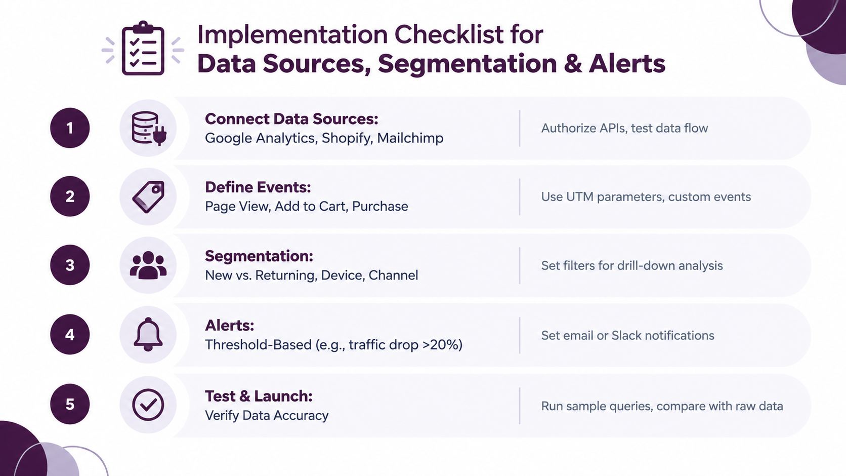
4. Add alerts with a human response
Alerts should identify an exception and tell someone what to inspect. A traffic warning might link to the channel breakdown, landing-page report, and tracking health panel. A conversion warning should distinguish a real performance decline from a delayed data feed.
Avoid alerting on every movement. Use business thresholds, historical patterns, or explicit operational conditions, then review false positives after launch.
5. Test before release
Compare dashboard values with raw platform reports, inspect event payloads, test filters, and check date controls. Run known scenarios, such as a test form submission or a controlled campaign parameter, and confirm that the action appears in the expected channel and conversion view.
The launch condition is not “the charts render.” It's “a user can trace a result back to its source and understand whether it's safe to act.”
Example Dashboard Templates and Use Cases in Action
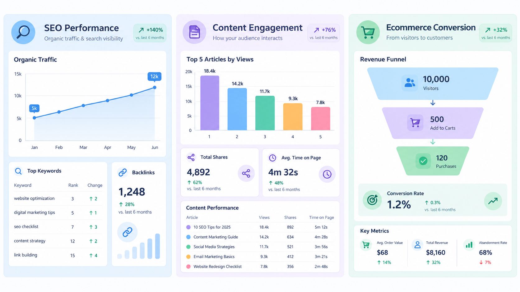
A good template starts with a question, not a widget. Three teams can use the same GA4 property and still need entirely different arrangements of the data.
The SEO performance dashboard
An SEO lead opens the dashboard after noticing that organic traffic appears weaker. The first row shows organic sessions, Search Console clicks, impressions, ranking movement, and organic conversions. A second view lists landing pages with the largest changes, alongside the queries that drove impressions and clicks.
The useful question isn't “Did traffic fall?” It's “Did search visibility fall, did click-through behavior change, or did the landing page stop converting?” A technical health panel can add context when the affected pages share a template, rendering issue, indexing problem, or performance warning.
This template should also expose data freshness. Search data may not align with onsite analytics for the same day, so the dashboard needs source-specific timestamps rather than one generic “updated” label.
The content engagement dashboard
A content manager wants to decide which articles deserve attention. The dashboard ranks pages by entrances, engaged activity, assisted conversions, and recent trend. It also highlights pages that attract search clicks but produce weak downstream engagement.
The team can separate content discovery from content influence. A page may introduce a visitor who converts later through another session, while a product comparison page may receive fewer entrances but contribute more directly to a lead. The dashboard should make those roles visible without treating every page as if it serves the same purpose.
A page-level table is more useful than a decorative chart here. Editors can filter by topic, format, funnel stage, or search intent, then create an optimization queue.
The ecommerce conversion dashboard
An ecommerce manager needs a funnel view from product discovery through purchase. The top row can show product views, add-to-cart activity, checkout progression, and purchases. Supporting tables can break down performance by product, device, channel, and landing page.
When purchases fall, the manager shouldn't have to compare separate reports to find the break. A dashboard should reveal whether fewer visitors reached product pages, fewer users added products, checkout steps lost momentum, or attribution became less complete.
Keyword Kick can be considered when an SEO team wants GA4 traffic alongside Search Console, rank tracking, backlink, and technical signals in one workspace. Its K² AI Agent is designed to answer questions such as why traffic changed and which pages deserve attention, while the team still needs to validate source definitions and data quality.
Troubleshooting Maintenance and Trust Signals for Your Dashboard
A dashboard can look consistent while measuring an inconsistent reality. GA4 reporting delays, thresholding, modeled data, consent loss, and attribution drift can all affect how confidently a team interprets a change. A polished card doesn't tell you whether its value is complete.
Add trust information directly to the interface:
- Freshness: Show the latest successful update for every source.
- Coverage: Explain where consent or privacy controls limit measurement.
- Confidence: Label attribution as observed, modeled, inferred, or ambiguous.
- Definitions: Link each KPI to its event logic and calculation.
- Warnings: Flag missing parameters, broken cross-domain tracking, and unusual data gaps.
AI-assisted referral traffic adds another layer of uncertainty. Reporting on AI referral attribution gaps says roughly 22% of ChatGPT sessions and 32% of Perplexity sessions may appear as “(not set)” or be absorbed into Direct traffic. That means a sudden increase in Direct traffic may represent a real channel change, incomplete referrer information, or both.
CampaignTrackly's discussion of GA4 dashboard data quality also highlights inconsistent campaign tracking, cross-domain problems, event naming weaknesses, warehouse export gaps, reporting delays, thresholding, and modeled data. Audit the dashboard on a schedule, but also add a pre-decision check: Is the data fresh, complete enough, and attributed with sufficient confidence for today's question?
Conclusion and Next Steps with an Integrated SEO Platform
A website analytics dashboard becomes decision-ready when it combines three disciplines: role-specific KPIs, clear visual hierarchy, and visible data quality. It should help a user move from a signal to a cause without pretending that every number is equally complete or precise.
That's why integrated SEO workspaces matter. GA4 alone can show onsite behavior, but SEO teams often need to connect it with Search Console, rankings, backlinks, technical audits, and page-level recommendations. Keyword Kick's K² AI Agent brings those SEO signals into one workspace and focuses the analysis on why performance changed and what deserves attention next.
The broader lesson is captured in this explanation of why data visibility is no longer enough. Visibility matters, but teams also need context, confidence, and a practical route to action. Start with one role-specific template, add trust signals before adding more widgets, validate the source data, and expand only when the next decision requires it.
Keyword Kick connects GA4, Search Console, rankings, backlinks, and technical SEO signals so your team can investigate traffic changes without stitching together separate reports. Visit Keyword Kick to explore an integrated workspace and start building a dashboard your growth team can trust.