

Many teams don't have a web analytics problem. They have a decision problem disguised as a dashboard problem. If your reports can tell you how many sessions you got but can't tell you what to change next week, you're collecting noise, not insight.
That's the core shift in web analytics metrics in the GA4 era. The old habit of treating traffic volume as proof of growth keeps failing because volume alone doesn't show intent, friction, or revenue impact. GA4's event-based model makes it easier to measure what matters, but only if you stop using legacy KPIs as comfort blankets and build a stack around decisions.
Why Most Web Analytics Metrics Fail to Drive Decisions
Most dashboards are crowded with metrics that look important and rarely change a single action. Sessions, users, and pageviews can be useful for trend spotting, but they don't tell you whether traffic is qualified, whether pages are persuasive, or whether campaigns are worth their cost. That's why many teams celebrate spikes in traffic while conversion quality weakens underneath.
Vanity metrics create false confidence
A high session count can mask weak intent. A long average session duration can hide confusion if people are wandering instead of progressing. Even total users becomes a blunt instrument when you need to know whether first-time visitors from a campaign are becoming customers.
GA4 gives you the raw ingredients to think differently, but the metric layer still needs discipline. An experienced team asks, “What decision does this number change?” If the answer is “none,” the metric belongs lower in the stack, not on the executive dashboard.
Practical rule: if a metric doesn't affect spend, content priorities, product fixes, or funnel design, it's probably a reporting metric, not a decision metric.
That's why conversion analysis deserves a direct path from traffic to business outcome. For a clean refresher on that part of the stack, Boocoo on turning visitors into customers is a useful companion read because it keeps the focus on outcomes instead of vanity.
The real job of analytics is prioritization
A useful analytics program doesn't ask for more charts. It asks which pages, channels, and audiences deserve attention first. That's where volume metrics fall short, because they don't tell you whether a page with modest traffic is producing the most qualified leads or whether a popular landing page is attracting the wrong audience.
The best teams also keep their reference material tight. If you need a broad primer on setup and terminology, this guide to web analytics is a good internal benchmark, but the work starts when you map each metric to a business decision.
When I audit GA4 properties, I usually find the same pattern. Teams can describe what happened, but not what should happen next. That gap is why the dashboard feels busy and the roadmap still feels uncertain.
The Four Pillars of Web Analytics Measurement
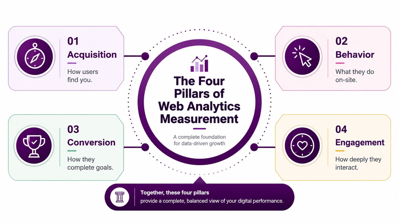
Many teams mistake a reporting problem for a decision problem. If your GA4 setup can show sessions and pageviews but cannot tell you what to change next week, you are collecting noise, not insight.
A clean measurement stack has four pillars. Each one answers a different question, and GA4 works best when they are separated clearly and assigned to the right owner.
Acquisition shows where demand starts
Acquisition metrics show how people found you. In GA4, that usually means session source and medium, first-user source, and campaign attribution. Those details matter because traffic can be plentiful and still be a poor fit.
An e-commerce team may care most about how paid shopping, email, and organic search differ in purchase intent. A B2B SaaS team may care more about first-user source, because the first touch often shapes the rest of the lead journey. The same traffic count can mean very different things depending on whether it came from a branded search, a cold social post, or a referral from a niche industry page.
Behavior shows what visitors actually do
Behavior metrics capture activity inside the site. That includes pageviews, events, paths, and on-site interactions. In GA4, the event model matters because it turns almost every meaningful action into something measurable, from a form start to a video play.
For an e-commerce site, product detail views, add-to-cart behavior, and checkout events matter more than a generic pageview count. For B2B SaaS, pricing page visits, demo requests, and feature interactions usually matter more than raw content consumption. Behavior tells you whether traffic is drifting or progressing.
Conversion and engagement complete the picture
Conversion metrics show when someone completes a goal. In GA4, key events have to be marked intentionally, and that is useful because it forces teams to decide what counts as value. Session-level and user-level conversion reporting can also tell different stories, especially when one visitor converts more than once across multiple visits.
Engagement metrics show how someone interacts. In GA4, engaged sessions are defined by a session lasting longer than 10 seconds, containing a key event, or including 2 or more page or screen views, and engagement rate is engaged sessions divided by total sessions. That makes the metric more useful than older bounce-only thinking, because it separates casual visits from meaningful ones GA4 engagement rate definition.
A modern stack needs all four pillars together. Acquisition tells you where to spend, behavior tells you where users hesitate, conversion tells you where value appears, and engagement tells you whether the visit had depth. Without that structure, GA4 turns into a scrapbook of unrelated numbers.
Engagement Rate Versus Bounce Rate in GA4
GA4 changed the conversation, but a lot of teams are still talking as if bounce rate still carries the same meaning it used to. It doesn't. Bounce rate in old reporting was a blunt proxy for a single-page session with no interaction, and that often misread useful visits as failures. Engagement rate in GA4 is stricter in a better way, because it counts sessions that lasted long enough, included a key event, or moved past the first page.
Why the same traffic can look good or bad depending on the metric
That difference matters because the same audience can be framed two ways. Independent benchmark content from 2026 reports a cross-industry median bounce rate of 47.4% and engagement rate of 52.6% benchmark data. Those figures don't mean the traffic is good or bad, they show how much the headline metric changes the story.
A single-page article can be valuable even if the session ends after one page. A pricing page can be highly effective even when it doesn't send people to a second page. In the old bounce-rate world, those sessions often looked like dead ends. In GA4, they can qualify as engaged if they last long enough or trigger the right event.
Useful framing: bounce rate is a rough loss signal. Engagement rate is a much better quality signal, but only if the page type matches the metric you're judging.
Benchmarks need context, not superstition
The problem with benchmark chasing is that teams often borrow the wrong comparison set. A content publisher, a product-led SaaS company, and an online store shouldn't judge success with the same threshold. Engagement needs to reflect intent. Informational content may tolerate shorter visits, while product and checkout flows need deeper interaction.
Industry or Content Type | Typical Engagement Rate | Interpretation Notes |
|---|---|---|
Content site | Qualitatively moderate to strong | A page can succeed on a single thoughtful visit if it answers the query cleanly |
E-commerce | Qualitatively stronger depth is expected | Product and checkout paths should generate deeper interaction before conversion |
B2B SaaS | Qualitatively mixed by page type | Blog pages, pricing pages, and demo pages should be judged differently |
Landing page | Qualitatively depends on offer intent | A focused page may convert without multiple pageviews |
The question isn't whether engagement rate is high or low in isolation. It's whether the metric matches the job of the page. If a landing page is built to capture a lead, then a quick conversion can be excellent behavior. If a blog post is meant to nurture interest, shallow engagement may be a sign that the promise and the content don't match.
How Page Speed and Core Web Vitals Shape Your Metrics
Technical performance is one of the fastest ways to misread analytics. If a page loads slowly or shifts around while people are trying to interact with it, your dashboard will often blame content, traffic quality, or campaign mismatch when the issue is render quality. That's why Core Web Vitals belong in the same conversation as engagement and conversion, not in a separate SEO silo.
Performance issues distort behavior before they distort revenue
Independent benchmark data for 2026 reports mobile Core Web Vitals pass rate at 48% in 2025 and desktop pass rate at 56%, with recommended targets of LCP at 2.5 seconds or less, INP at 200 milliseconds or less, and CLS at 0.1 or less benchmark summary. Those thresholds matter because slow or unstable experiences reduce the chance that a session becomes engaged at all.
If users wait too long for the main content, they're less likely to read, click, or scroll. If the interface reacts sluggishly, they're less likely to complete the steps that qualify a session as meaningful. In practice, that means a drop in engagement rate can be a speed problem, not a message problem.
The best diagnostics compare analytics with performance data
The fastest way to separate content issues from technical issues is to cross-reference GA4 with page speed reporting. This Core Web Vitals guide for SEOs is a useful companion when you need to connect search performance with user experience. The point isn't to obsess over lab scores, it's to find the pages where real sessions are already arriving but technical friction is suppressing outcomes.
Core Web Vital | Good Threshold | Poor Threshold | Impact on Engagement Rate | Impact on Conversion Rate |
|---|---|---|---|---|
LCP | 2.5 seconds or less | Slower than target | Slow loading reduces the chance that users stay long enough to engage | Longer wait times can interrupt intent before the offer is understood |
INP | 200 milliseconds or less | Slower than target | Laggy interaction lowers the odds of deeper sessions | Delayed responses can stop form fills and checkout progress |
CLS | 0.1 or less | Higher than target | Layout shifts make the page feel unstable and harder to use | Shifting buttons and fields can derail conversions |
A good audit starts with pages that already receive meaningful traffic. If those pages fail performance thresholds, the upside is usually bigger than chasing new visits. That's the critical point many miss.
Choosing the Right Metrics for Your Business Goals
The right metric set depends on the business model, not on what the dashboard template happened to include. A company optimizing for leads should not weigh the same numbers as an e-commerce store or a media site. That sounds obvious, but in practice I still see teams using the same top-line metrics for completely different jobs.
Match the metric to the revenue path
If the business sells products directly, the most useful numbers are usually tied to merchandising and checkout behavior. For B2B lead generation, the strongest metrics are the ones that show whether qualified visitors complete forms, request demos, or move into a sales workflow. For content monetization, you need a better view of loyalty and session quality than a raw session spike can provide.
A lot of teams overvalue pageviews because they're easy to explain in a meeting. They're also easy to misread. A metric becomes useful only when it predicts progress toward revenue, retention, or pipeline.
Use a tiered stack instead of a flat dashboard
A practical dashboard usually has three layers. The first is a north star metric that leadership can understand without context. The second is a supporting layer of KPIs that explain movement. The third is a diagnostic layer that flags the reasons the top layer changed.
Practical rule: a north star metric should be hard to game, hard to misread, and close enough to revenue that the team trusts it.
A simple decision matrix helps. It forces the question, “What do we measure if we care about this business model?”
Business Goal | North Star Metric | Supporting KPIs | Diagnostic Signals | Vanity Metrics to Ignore |
|---|---|---|---|---|
E-commerce revenue | Revenue from engaged sessions | Add-to-cart, checkout progression, product detail views | Cart abandonment patterns, device splits, page speed issues | Raw pageviews, total users |
B2B lead generation | Qualified key event completions | Demo requests, form starts, pricing page visits | Landing page drop-off, source quality, intent mismatch | Average session duration, sessions |
Content monetization | Engaged sessions per returning user | Scroll depth, repeat visits, newsletter signups | Article-level exit patterns, referral quality, load time | Total users, pageviews alone |
SaaS trial growth | Trial starts from high-intent pages | Feature page visits, signup completions, activation events | Channel mix, onboarding friction, product page engagement | Session count, bounce rate alone |
The point isn't to track fewer things. It's to track the right things in the right order. When the stack is built well, finance, product, and marketing can each get the signal they need without forcing one metric to do every job.
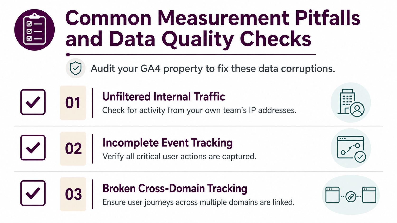
Common Measurement Pitfalls and Data Quality Checks
Bad data is expensive because it looks authoritative. In GA4, a tracking issue can change the story without throwing an obvious error, which is why a clean measurement audit matters as much as the dashboard itself. If the inputs are broken, the decisions will be too.
The failures that quietly corrupt reports
The most common problems are rarely dramatic. Duplicate tags can fire events twice. Cross-domain tracking can break a single journey into two sessions. Internal traffic can inflate volume. Consent mode misconfiguration can create sudden drops that look like demand problems.
A monthly hygiene pass catches more than people expect. Check DebugView and real-time reports for event firing, confirm that key events are marked for conversion, and review custom dimensions for cardinality problems. If you handle regulated traffic or work with multiple teams, also look for PII leakage in event parameters before it becomes a governance issue.
What to check every month
Duplicate firing: compare key event counts against intended user actions and look for doubled values after tag changes.
Cross-domain continuity: confirm that users moving across separate domains keep a single journey rather than fragmenting into disconnected visits.
Internal traffic filtering: validate that your team's own activity is excluded, especially after office network or VPN changes.
Bot and spam patterns: watch for odd session depth, strange engagement spikes, or traffic sources that don't fit normal referral behavior.
Exploration quality: review whether sampling or narrow segments are distorting high-traffic analysis views.
You don't need a giant governance process to improve this. You need a repeatable audit rhythm. The teams that trust their dashboards most are usually the ones that check the plumbing most often.
Measuring Human Traffic in an AI-Mediated Web
A falling session count can still mean demand is shifting, not disappearing. As people get answers from AI overviews, chatbots, and other zero-click paths, some of the interest that used to arrive as traffic gets absorbed before the pageview happens. That changes how web analytics metrics should be read, because session volume is becoming a weaker proxy for human demand.
Human intent is harder to measure than raw traffic
Industry coverage argues that teams now need analytics that separate human traffic from automated activity, and that the metric discussion is shifting toward human sessions as search behavior moves toward chatbots and virtual agents AI-era analytics discussion. That matters because visits are not equally valuable, and a missing visit does not always mean invisibility.
The practical check is behavior that bots and scrapers rarely mimic well. Scroll depth, interaction events, authenticated user ratios, and multi-step engagement patterns are more trustworthy than raw session totals. If your traffic drops while conversions from the remaining sessions stay steady, the issue may be measurement context rather than market demand.
Direct traffic is often a catch-all, not a clean answer
Many teams file AI-mediated or untagged activity under direct traffic and stop there. That hides more than it reveals. A clearer treatment of referral gaps and unassigned visits starts with knowing what direct traffic can and cannot represent, which is why this guide to direct traffic in Google Analytics helps when sessions start behaving strangely.
The goal is not to inflate numbers. It is to separate real human demand from everything else so planning is based on the audience you can influence. That gives content strategy, paid spend, and sales expectations a better baseline.
Building Your Action-Oriented Analytics Dashboard
A dashboard earns its place when every widget answers a question someone asks. The best GA4 setups I've seen are not the prettiest, they're the ones that help people make decisions in the first five minutes of a weekly review. That usually means separating executive reporting, growth analysis, and data health into different layers.
A simple three-tier structure works best
The top tier should show revenue-attributed conversions and engaged sessions by channel. That gives leadership a fast read on whether traffic quality and business outcomes are moving together. The middle tier should map acquisition sources to engagement rate and micro-conversion steps, because that's where marketers and content teams can see which pages or campaigns deserve more investment.
The diagnostic tier is where the quiet problems surface. Sudden drops in event counts, spikes in unassigned traffic, or odd shifts in engagement rate often point to broken tags, source attribution issues, or landing page mismatches rather than market changes.
A GA4 exploration that actually helps
A practical exploration usually starts with source medium, landing page, device category, and key event completion. Add a filter for organic search, paid, or email if you need channel-specific reviews. Then segment by engaged sessions so you can see which acquisition sources are producing meaningful visits instead of just visits.
For teams using a broader SEO workspace, Keyword Kick connects GA4 and Google Search Console in one environment, which makes it easier to compare traffic changes with ranking and search visibility signals without bouncing between tools.
Dashboard Tier | Primary Audience | Core Metrics | Decision Triggered |
|---|---|---|---|
Executive view | Leadership | Revenue-attributed conversions, engaged sessions by channel | Budget shifts, campaign prioritization |
Growth view | Marketing, content, product | Acquisition source, engagement rate, micro-conversions | Page updates, funnel experiments, channel reallocation |
Diagnostic view | Analytics, engineering | Event count anomalies, unassigned traffic, conversion drops | Tag fixes, attribution cleanup, QA checks |
A strong 30-day reset is usually enough to improve the stack. Audit naming conventions, validate cross-domain tracking, confirm key events, and write down alert thresholds before the next reporting cycle starts. If the dashboard doesn't lead to a decision, cut it.
Keyword Kick helps teams connect GA4, Search Console, rank tracking, backlinks, and technical SEO signals into one working view, so traffic changes don't stay trapped in separate reports. If you want a stack that ties web analytics metrics to clear next steps instead of endless screenshots, visit Keyword Kick and see how it brings the data together.