Button colors are rarely the reason a landing page fails. If the visitor arrives with the wrong intent, sees a promise that doesn't match the ad, or encounters a slow mobile experience, changing the CTA from blue to green won't rescue the campaign. Effective landing page optimization starts with diagnosis, then uses design and experimentation to remove the specific friction that prevents a qualified visitor from acting.
A landing page is a conversion system, not a decorative asset. Its performance depends on the relationship between traffic source, offer, message, technical delivery, user experience, and measurement. Treat those parts as connected, and your tests become more useful. Treat them as isolated page elements, and you'll spend weeks optimizing symptoms.
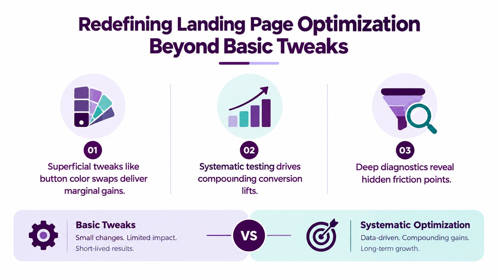
Redefining Landing Page Optimization Beyond Basic Tweaks
Many teams still approach landing page optimization as a visual checklist. They move testimonials closer to the form, change button colors, shorten a headline, and publish the variation without establishing what problem the change is meant to solve. Those adjustments can help, but they rarely deserve priority over a broken message match, an unsuitable offer, or traffic with weak commercial intent.
The more useful question isn't “Which design looks better?” It's “Where does the conversion path stop making sense for this visitor?” A low conversion rate may indicate poor page design, but it may also reveal that the campaign attracts people who aren't ready to act, that the ad promises something the page doesn't deliver, or that the form asks for information before trust has been established.
Benchmark the page without chasing averages
A large-scale benchmark covering 41,000 pages, 464 million visitors, and 57 million conversions found a 6.6% median landing page conversion rate across industries, as reported in this landing page conversion benchmark. The median is more useful than a simple average because a handful of exceptional pages can distort an average and create unrealistic expectations for ordinary campaigns.
The same benchmark places top-quartile pages above 10%, while performance varies substantially by market. Catering and restaurants have a 9.8% median, media and entertainment sits at 7.9%, finance and insurance at 6.2%, and education at 5.8%, according to that benchmark. These figures aren't targets to copy blindly. They're context for deciding whether a page has a measurement problem, a traffic problem, or a genuine optimization opportunity.
A page converting near the overall median is turning roughly one visitor in fifteen into a conversion. That means improvements to the offer, page clarity, speed, and form experience can compound without requiring additional traffic. The practical advantage comes from improving the quality of each visit, not from making every visual element more dramatic.
Replace the checklist with a diagnostic loop
A disciplined optimization cycle has a clear order:
- Define the conversion: Choose one primary action, such as requesting a quote, starting a trial, booking a call, or completing a purchase.
- Identify the visitor: Separate traffic by source, campaign, device, geography, and intent before combining performance into one rate.
- Find the break: Examine the steps between landing and conversion, including scroll depth, form starts, field errors, CTA clicks, and abandonment.
- Form a hypothesis: State what you think is stopping the visitor and why a specific change should address it.
- Test the change: Keep the variation narrow enough that the result teaches you something useful.
The field has moved from broad web design advice toward measurable conversion science because marketers can now compare performance across large datasets, traffic segments, and controlled experiments. For a practical companion to the fundamentals, these landing page tips from Samuel Woods are useful when translating principles into page-level decisions.
Practical rule: Don't optimize an element until you can explain which visitor problem it addresses and which measurement will prove whether the problem improved.
Diagnosing Traffic Quality and Message Match First
The fastest way to waste a CRO budget is to redesign a page before checking who arrives on it. A high bounce rate can reflect a poor page, but it can also reflect an ad that targets broad curiosity, a keyword that signals research rather than purchase intent, or an offer that doesn't fit the visitor's immediate need.
Start by creating separate baselines. At minimum, split performance by traffic source, campaign, device, audience temperature, and landing page variant. Paid search traffic for a high-intent product term shouldn't share a baseline with display traffic aimed at general awareness. An email subscriber who already knows the brand shouldn't be evaluated alongside a first-time visitor from a broad prospecting campaign.
Test the promise before the pixels
Message match is the continuity between the source message and the landing experience. A search ad about “same-day emergency plumbing” should lead to a page that confirms that service, availability, and next step immediately. If the landing page opens with a general company statement or a menu of unrelated services, the visitor has to reconstruct the relevance you already established in the ad.
Use a simple comparison:
- Record the source promise. Copy the ad headline, keyword theme, email subject, social creative, or referral context.
- Compare the first screen. Check whether the landing page headline, supporting copy, visual, and CTA answer the same need.
- Inspect intent depth. Separate visitors seeking information from those comparing providers or ready to contact sales.
- Review the offer. Confirm that the value offered on the page is specific enough for the traffic source.
- Look for segment divergence. A page may work well for returning visitors while confusing first-time mobile users.
Traffic quality often explains why overall conversion looks weak while one segment performs strongly. Warm email audiences can convert at around 19.3%, while broad traffic pools may sit much lower, as summarized in this analysis of bounce rate and search landing pages. The contrast doesn't prove that the page is healthy for every audience. It tells you to stop treating the blended rate as a diagnosis.
Separate the page problem from the acquisition problem
A useful decision tree is:
- Low engagement before the page loads: Investigate targeting, keyword intent, ad promise, and technical delivery.
- Strong engagement but weak CTA interaction: Review the offer, headline clarity, proof, objections, and visual hierarchy.
- Strong CTA clicks but weak form completion: Inspect fields, validation, privacy concerns, error handling, and the next-step promise.
- Strong form completion but poor sales quality: Reassess qualification, targeting, offer framing, and the definition of a conversion.
- High bounce with strong downstream performance: Check whether analytics misclassifies a legitimate interaction or whether the audience is scanning before returning later.
Search data can expose the mismatch more clearly than page analytics alone. Use reporting workflows that turn search data into fixes, then connect those findings to campaign and device-level behavior.
The point is not to lower bounce rate at any cost. A visitor who leaves because the page correctly disqualifies an unsuitable prospect may be more valuable than a low-quality lead. Optimize for the right action and the right audience, not for a prettier dashboard.
Engineering Technical Performance and Core Web Vitals
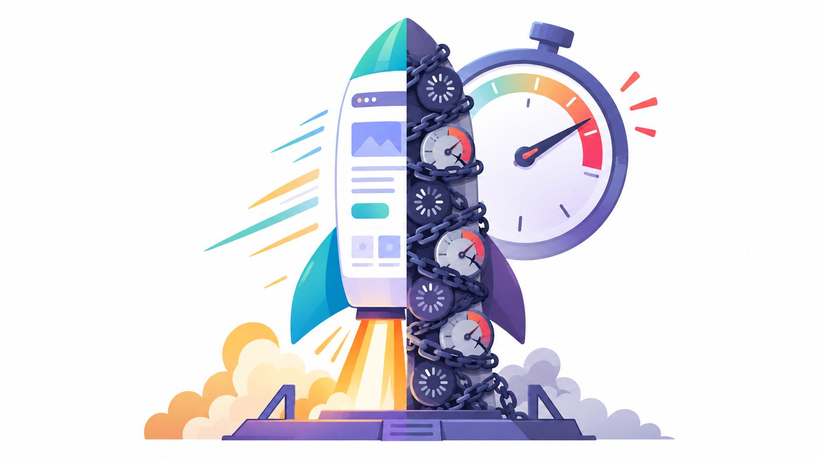
A persuasive page can't convert if the visitor has to wait for the offer to appear. Performance belongs in the conversion model because latency affects whether people see the headline, interact with the form, and trust the page enough to continue.
Google's Core Web Vitals guidance sets a target of Largest Contentful Paint at 2.5 seconds or less. You can find a practical reference in this Core Web Vitals explained for 2026. For landing pages, the target matters most when the largest element contains the value proposition, product image, form, or CTA.
Find the assets that delay the first useful view
Begin with field data from real users, then use lab tools such as Lighthouse and Chrome DevTools to isolate causes. A technically sound workflow should examine:
- Largest Contentful Paint: Identify whether the hero image, video poster, heading, or background asset is arriving late.
- JavaScript execution: Remove scripts that aren't required for the first interaction, and defer nonessential analytics or personalization code.
- Image delivery: Use appropriately sized responsive images, modern formats where supported, and explicit dimensions to reduce layout shifts.
- Font loading: Limit unnecessary font families and weights, then choose a loading strategy that prevents invisible or unstable text.
- Mobile layout: Test on real phones and constrained connections, not only on a fast desktop browser.
- Third-party requests: Review chat widgets, ad pixels, heatmaps, embedded videos, and recommendation tools individually.
A 1-second load delay can reduce conversions by about 7%, while pages loading in 1 second can achieve roughly 3 times the conversion rate of pages taking 5 seconds, according to figures summarized in this landing page speed and testing research. These benchmarks aren't a guarantee for every campaign, but they show why performance should be tested as a conversion variable rather than filed solely under SEO maintenance.
Improve speed without damaging persuasion
Removing every visual element isn't optimization. A product demonstration, customer image, or short explainer can reduce uncertainty, but it needs to justify its performance cost. Compress it, lazy-load content below the first screen, and avoid making the visitor wait for a video before revealing the core offer.
Don't rely on a single speed score either. A laboratory score can look healthy while field users experience slow rendering because of device constraints, network conditions, or regional infrastructure. Compare performance by device and source, then connect load milestones to behavioral events such as hero visibility, form start, CTA click, and conversion.
A fast page also needs stable interaction. Reserve space for images and embeds, prevent consent banners from covering the CTA, and make form controls usable with touch input. Technical performance is successful when the visitor can understand the promise and take the next step without delay or confusion.
Structuring Copy and UX for Frictionless Conversions
Once the right visitor reaches a responsive page, the page has one job: make the next action feel relevant, credible, and easy. That doesn't mean hiding important information. It means giving each piece of information a role in the decision instead of stacking every possible feature, credential, and objection into one long scroll.
Lead with the visitor's problem or desired outcome. Then explain how the offer addresses it, provide proof that reduces perceived risk, clarify what happens after the CTA, and answer the objections that could block action. A headline that merely describes the company forces the visitor to do the interpretation themselves.
Reduce cognitive load before reducing content
Fewer elements often create a cleaner path, but “minimal” isn't automatically better. A high-consideration service may need proof, specifications, pricing context, or an explanation of the process. The correct test is whether each element helps the visitor decide.
| Page Configuration | Relative Conversion Impact | Primary Friction Point |
|---|---|---|
| Focused page with one offer and one primary CTA | Usually reduces distraction and clarifies the decision | Missing detail can create hesitation |
| Page with relevant proof near the claim it supports | Can strengthen trust when the proof is specific | Generic testimonials may add visual noise |
| Short form asking only for essential information | Often lowers perceived effort | The team may lose useful qualification data |
| Long form with several optional or premature fields | Usually increases resistance before value is established | Visitors may abandon before submitting |
| Dense page with multiple competing actions | Makes prioritization harder | Attention is divided across different paths |
A short form isn't always superior. If sales needs context to qualify a lead, removing every field may increase low-quality submissions. A better approach is to ask for the minimum information required for the current commitment, then collect additional detail later when the visitor has received more value.
Write for the stage of awareness
A cold visitor needs a clear reason to care. A returning visitor may need reassurance, comparison information, or a faster route to action. Use the same offer architecture across segments only when the underlying need is genuinely similar.
A useful copy sequence looks like this:
- Specific headline: Reflect the problem, audience, or outcome represented in the acquisition message.
- Supporting promise: Explain what the visitor gets and why the offer is credible.
- Proof near uncertainty: Place reviews, customer logos, demonstrations, guarantees, or evidence beside the claim they support.
- Action-oriented CTA: Describe the next step and its value, rather than using vague labels such as “Submit.”
- Expectation setting: Tell visitors what happens after the click, including timing, contact method, or required preparation.
CTA language should match commitment level. “Compare plans” suits an evaluation stage. “Book a consultation” signals a higher commitment. “Download the checklist” is appropriate when the visitor is exchanging contact details for information. The button isn't persuasive in isolation. Its label, surrounding copy, form, and post-click experience create the decision.
Use search data to turn search data into conversions when deciding which objections and benefits deserve space on the page. Search language often reveals the words people use for urgency, uncertainty, alternatives, and desired outcomes.
A shorter page isn't the goal. A clearer decision is the goal.
Running Structured Experiments and A/B Tests
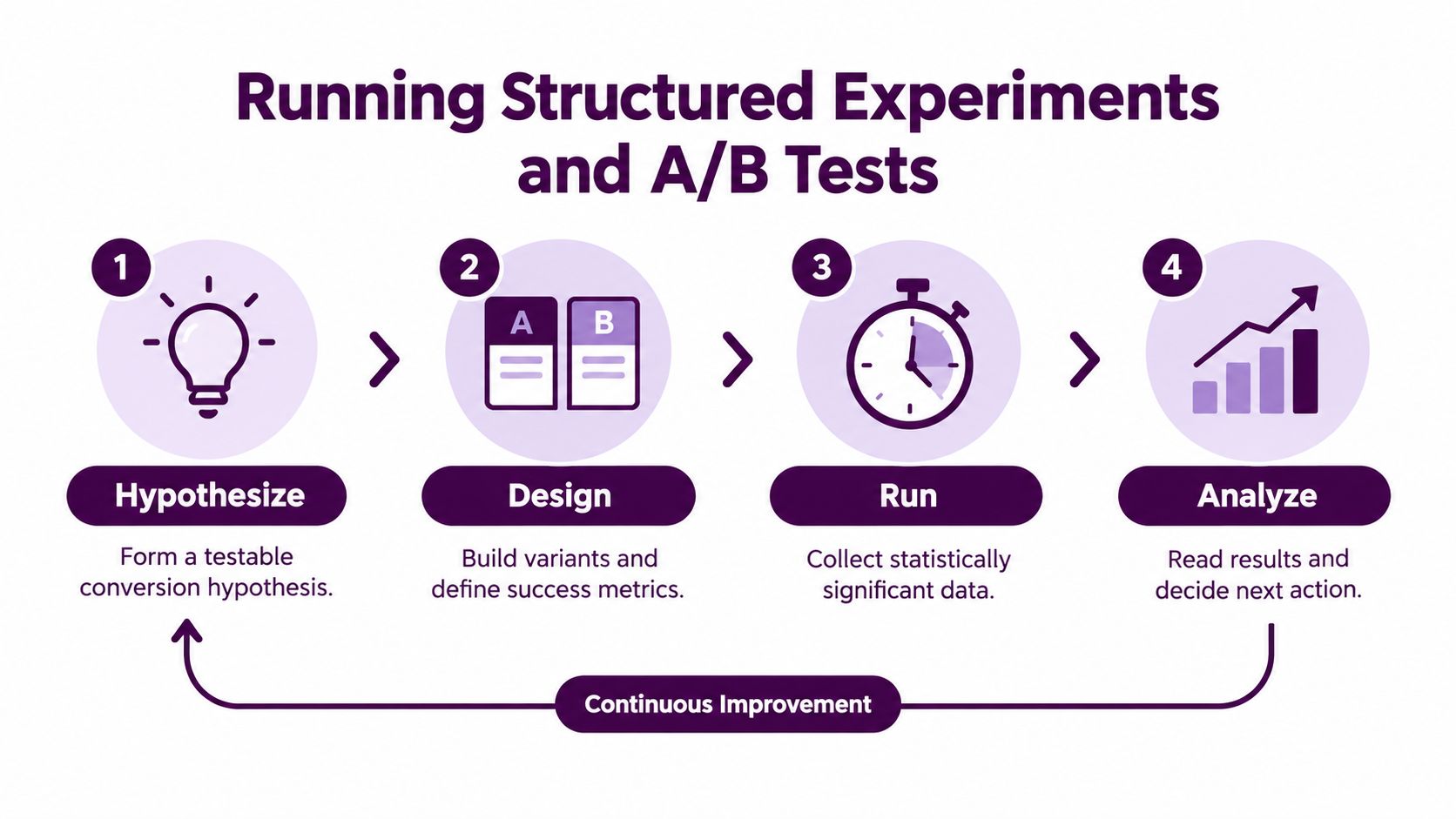
Publishing a redesign and calling it optimization creates a false sense of progress. A result becomes useful only when the team knows what changed, which audience saw it, what action counted as success, and how the result should influence the next decision.
A structured experiment pipeline begins with one primary conversion goal. Secondary measures, such as CTA clicks, form starts, or qualified lead rate, help explain the result, but they shouldn't replace the main outcome after the test begins.
Build a hypothesis that can fail
Weak hypothesis: “A new hero section will improve conversions.”
Stronger hypothesis: “Visitors from the emergency plumbing campaign aren't seeing service availability above the first screen. Repeating the availability promise beside the primary CTA should increase qualified booking completions without changing the offer.”
The second version identifies an audience, a suspected problem, a change, and a measurable outcome. It can be wrong, which is useful. If the variation loses, the team learns that the diagnosis or intervention needs revision.
Isolate the lesson
Test one high-impact variable when the goal is to understand causality. That variable might be the offer, headline, form length, proof placement, CTA copy, or page load behavior. Changing the headline, layout, imagery, form, and pricing at the same time can produce a winner, but it won't tell you which change created the result or whether the combination will work for another segment.
A practical test record should include:
- Audience definition: Specify source, device, geography, and eligibility.
- Control description: Document the current experience and its primary conversion event.
- Variant change: Describe exactly what differs and what remains constant.
- Guardrail metrics: Monitor lead quality, revenue quality, errors, refunds, or other downstream risks.
- Decision rule: Set the evidence standard and minimum run conditions before reviewing results.
- Follow-up action: Keep, reject, iterate, or test the insight with a different segment.
A/B testing has been shown to improve landing page conversions by 49% on average, while only 44% of companies regularly test their landing pages, according to the benchmark coverage cited earlier. Those figures point to an execution gap, but they don't mean every test will produce a lift. Test quality depends on sample quality, clean tracking, a meaningful hypothesis, and enough evidence to distinguish a real effect from noise.
Use AI where it reduces work, not judgment
AI-assisted experimentation can help teams generate variants, identify segment patterns, summarize session behavior, and prioritize possible tests. Recent industry coverage reports that AI-assisted A/B testing adoption surpassed 61% among mid-market brands, as described in this coverage of landing page conversion benchmarks and AI testing.
The tool shouldn't decide that every visitor needs a different page. Dynamic personalization adds implementation complexity, QA requirements, and a risk of fragmenting evidence across too many variants. Start with stable improvements that address broad friction, such as clearer headlines, fewer form fields, better mobile interaction, or stronger proof placement. Add personalization when the segment has a distinct need, enough traffic to evaluate the experience, and a reliable reason to expect the variation to outperform a shared page.
Prioritizing Your Optimization Roadmap
A backlog full of plausible ideas is not a strategy. Teams need a way to decide which problem deserves attention before they spend design, engineering, or media resources on it.
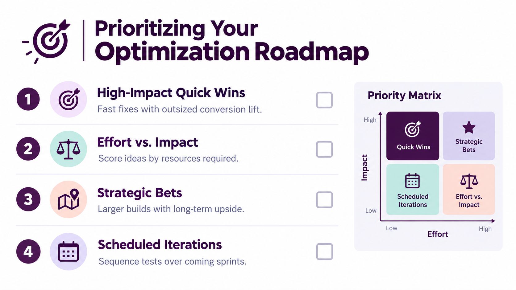
Rank opportunities by potential impact, confidence in the diagnosis, implementation effort, and available traffic. A technically simple change with strong evidence and broad exposure should usually precede an ambitious personalization project that serves a small, poorly understood segment.
Start with the bottleneck closest to the cause
Use this sequence:
- Message match first: Confirm that the source promise, landing page headline, offer, and CTA describe the same next step.
- Performance next: Fix slow rendering, unstable layouts, blocked interactions, and mobile usability problems before judging copy or design.
- Friction after that: Reduce unnecessary fields, clarify form errors, remove competing actions, and explain what happens after conversion.
- Proof and objections: Add evidence where visitors hesitate, not wherever there happens to be empty space.
- Personalization last: Create dynamic experiences only after the shared experience is clear and segment-specific evidence supports the investment.
This order prevents teams from polishing a page that attracts the wrong audience or loads too slowly to be evaluated. It also protects learning. If you change targeting, page speed, headline, and form structure simultaneously, any performance movement becomes difficult to interpret.
Make the matrix operational
Give each idea a simple assessment:
| Criterion | High-priority signal | Low-priority signal |
|---|---|---|
| Potential impact | Affects the main conversion path or a large audience segment | Changes a peripheral visual detail |
| Diagnostic confidence | Supported by segmented analytics, recordings, search data, or user feedback | Based mainly on personal preference |
| Implementation effort | Can be shipped and measured with existing systems | Requires a complex rebuild or many dependencies |
| Traffic availability | Receives enough relevant traffic to produce a useful read | Has too little qualified traffic for a dependable test |
| Business risk | Improves the desired conversion without weakening quality | Could increase volume while harming qualification or revenue |
Quick wins aren't defined by how easy they are to code. They're changes that address a meaningful obstacle with limited delivery risk. Rewriting a headline may be quick, but it shouldn't outrank a broken form submission or a page that fails on mobile.
Turn findings into scheduled work
Create a roadmap with owners, evidence, expected effort, and a decision date. Reserve capacity for analysis after every test, because a losing variation can still reveal a segment difference, a message problem, or an incorrect assumption about visitor motivation.
Review the roadmap when acquisition changes. A new keyword group, offer, device mix, or sales process can create a different conversion bottleneck. Landing page optimization works best as an operating rhythm, with diagnosis informing tests and test results informing the next diagnosis.
Keyword Kick connects Google Analytics 4, Google Search Console, rank tracking, backlinks, audits, and technical SEO signals so teams can turn fragmented search data into prioritized actions that support landing page decisions. Visit Keyword Kick to identify which pages and search opportunities deserve attention before you invest in another CRO test.